Committee members include:
- Bryan Hantman (website)
- Kim Blair (institutional advancement)
- John Carlin (public relations)
- Dan Hodges (information systems)
- Beth Shively (registrar/academic affairs)
- Yvonne Walker (registrar/academic affairs)
- Susan Cook (academic affairs, part-time student)
- Jessica Luther (business office)
- M.A. Whisenant (human resources)
- Jason Byrd (admissions, Ferrum alum)
- Jason Jones (student affairs)
- Tina Hanlon (faculty)
- Gail Summer (provost office/academic affairs)
- Meghan Hodges (current student)
What we've been up to:
CARD SORTING
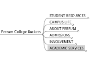
Card sorting is a technique in "user experience design" where a group of people, however experienced with design, generate a category tree or series of groups. In our case, the committee took all pages from the website and reorganized them into buckets as a way of putting "like with like" together.
(http://www.flickr.com//photos/ferrumcollege/sets/72157630556881444/show/)
The resulting card sorting exercise got us to a new information architecture...
DESIGN PERSONAS
Design personas are fictional characters created to represent the different user types within a targeted demographic. We used six personas for this exercise.
Our questions, comments, and epiphanies are on the white board:
 |
| Naming our "buckets" or resource-based way of organizing our web site. These "buckets" were created from our work with card sorting and developing the information architecture. |
 |
| Our groups thought about how different audience types might think about these buckets. |
INFORMATION ARCHITECTURE
Information architecture is the art and science of organizing and labelling web sites. (Click on any of the images to see a larger version.)
 |
| These are the categories we came up with... the bucket names were placeholders at this point |
 |
| This bucket was later named academics |
 |
| Currently named "student links." Do you have another suggestion? |
 |
| Campus life bucket |
 |
| About Ferrum bucket |
 |
| Admissions bucket |
 |
| This bucket was later named Giving to Ferrum or Support Ferrum. We still need help with this one... |
A website wireframe is a visual guide or skeletal framework of a website. A wireframe depicts a web page layout or arrangement of the website’s content, including interface elements and navigational systems, and how they work together.
In our case I designed two wireframes, one for the homepage and one for an inner page.
Note that wireframes lack typographic style, color, or graphics, since the main focus lies in functionality, behavior, and priority of content.
TWO WIREFRAMES:
 |
| Homepage |
 |
| Inner page |

Really nice post! I love this post. Keep it up...
ReplyDeleteAmazing post! I always like these type all post. You did good job.
ReplyDeletereallyy nice layout :)
ReplyDelete